|
Name
|
Description
|

|
TChartPanelListeners
|
Maintains an interface list that only contains IChartPanelListeners and notifies the owner when things change
The TRSChartPanel and TRSCustomChart classes use this class to maintain the list of listeners interested in changes to their state.
|
|
TControlCrack
|
Represents type TControlCrack.
|
|
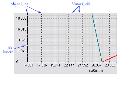
TRSAxisGrid
|
Extends the TRSChartGraphic class to encapsulate properties about grid tick marks, including pen length and MinorTickCount. The TRSAxisGrid class implements these properties for the RSChartPanel.TRSChartAxis class as its Grid property.
|
|
TRSChartAxis
|
Extends the RSChartPanel.TRSChartGraphic class to provide the properties and behavior of a chart axis for a RSChartPanel.TRSCustomChartPanel component. The TRSChartAxis class is responsible for managing the display of an axis (e.g., grid lines, labels, title) and for managing the range of chart values on an axis and converting between axis values and pixel values.
The TRSCustomChartPanel component uses the TRSChartAxis class for its four axes: BottomAxis, LeftAxis, RightAxis, and TopAxis. A RSChartPanel.TRSCustomChart component also keeps a reference to the horizontal and vertical axis that apply to its chart values (see HorizontalAxis and VerticalAxis properties).
The most important properties of the chart axis class are the Minimum and Maximum properties, which specify the range of the axis, and the ZoomMinimum and ZoomMaximum properties, which specify the zoomed range (e.g., visible range) of the axis. The Options property controls the display of the axis and well as controlling whether the axis automatically updates its Minimum and Maximum range values based on the Charts, and their values, assigned to the axis.
The most important methods of the axis are the AxisToPixel and PixelToAxis methods, which are responsible for converting between the actual values of the axis and their location on a Canvas.
|
|
TRSChartGradient
|
Extends the RSChartPanel.TRSChartGraphic class to provide the properties and the drawing code to paint a gradient in an area of the chart panel.
|
|
TRSChartGraphic
|
Defines a base class for graphic (label, axis, etc) object in the chart panel or a chart
|
|
TRSChartGraphicArea
|
Extends the RSChartPanel.TRSChartGraphic class to add graphical properties that are useful for chart panel graphics that paint on an area of the panel, such as Brush and Pen .
|
|
TRSChartHeader
|
Implements the properties and methods necessary to display a header or footer in a chart panel. This includes properties such as Text and Font. The TRSChartHeader class extends the RSChartPanel.TRSChartImageArea class and redefines the Draw method to properly draw a header or footer.
|
|
TRSChartImageArea
|
Extends the RSChartPanel.TRSChartGraphicArea class to provide the ability to display an Image in the graphic area, such as for the RSChartPanel.TRSChartHeader.
|
|
TRSChartLabel
|
Extends the RSChartPanel.TRSChartLabelMetaData class to publish not only the metadata of a label but the actual label ( Text property) itself.
|
|
TRSChartLabelMetaData
|
Extends the RSChartPanel.TRSCustomChartLabel class and publishes the metadata of a label, e.g., all the properties about the label except for the label itself. This class is useful for classes such as the RSChartPanel.TRSChartLegend class, where you don't want to publish the Text property because the label is automatically generated by the charts yet you do want to publish properties to control the appearance of the label.
|
|
TRSChartLayer
|
Extends the RSChartPanel.TRSChartGraphic class to provide additional properties that are useful for a chart layer. A chart layer is similar to layers in Adobe Photoshop. The RSChartPanel.TRSChartPanel component displays itself using layers: there is a background layer that is painted first followed by a gradient layer which is painted on top (and can obscure) the background layer. Then, the charts and related graphical elements are displayed (e.g., header, footer, legend, axes). Finally, the TRSChartPanel paints a foreground layer on top of everything. The TRSChartLayer class provides the graphical properties for the Background and Foreground layers.
|
|
TRSChartLegend
|
Extends the RSChartPanel.TRSChartLabelMetaData class to provide the ability to draw the legend of a chart panel. It also adds properties for the legend, including BoxSize, Lines , and LegendStyle .
|
|
TRSChartList
|
Encapsulates a list of RSChartPanel.TRSCustomChart components. The RSChartPanel.TRSCustomChartPanel component uses this class ( Charts property) to hold what charts to display in the panel. The RSChartPanel.TRSChartAxis class uses this class ( Charts property) to hold the charts that are associated with the axis.
 Note Note
|
The order of the charts in the list matters. For the chart panel, the chart at Index 0 is drawn first, and then every chart is drawn over it. For the chart axis, the first chart defines the labels.
|
|
|
TRSChartListEnumerator
|
Represents type TRSChartListEnumerator.
|
|
TRSChartPanel
|
The TRSChartPanel component publishes the properties and events of its TRSCustomChartPanel component ancestor. The TRSCustomChartPanel component provides the panel or the canvas which is the visual parent of the charts (and where they are drawn) and where the user interacts with the charts (zooming, panning, selecting). It provides the ability to significantly customize the look and feel of objects that are drawn with a chart: axes, legend, shadow, gradients, foreground and background, etc.
| • | Background (the surface or layer behind all chart panel elements) |
| • | Gradient (Drawn behind the chart panel elements and obscures the Background) |
| • | Header (the area above where the charts are drawn) |
| • | Footer (the area below where the charts are drawn) |
| • | Legend (the text box that labels the charts or their values) |
| • | Foreground (the surface or layer in front of all chart panel elements) |
|
|
|
|
|
|
|
|
|
|
|
|
|
|
|
|
|
|
|
|
|
|
|
|
|
In addition, the ChartShadow defines the attributes of the shadow that all chart elements can optionally cast.Except for the panel and the charts, each element of the chart descends, either directly or indirectly, from the TRSChartGraphic class, which provides common properties and methods of the elements of the chart. You can control which elements are drawn by setting each element's Visible property.
|
|
|
|
TRSChartShadow
|
Extends the RSChartPanel.TRSChartGraphicArea class to add properties and methods for drawing a shadow for an element of the chart panel or a chart. The shadow class accepts a Size and Direction, which specify the Size in pixels and Direction of the shadow.
The following graphic shows the interrelationships of the elements of the TRSChartShadow class: 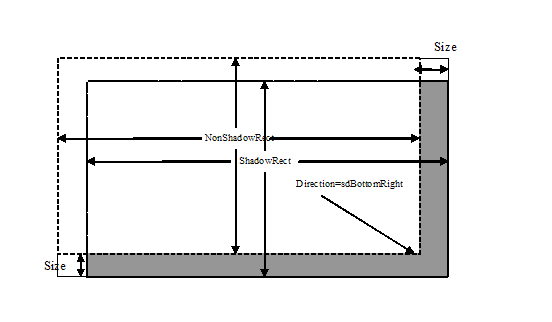
|
|
TRSChartValue
|
Defines one point/pie/bar/etc in a chart. A chart is made up of a collection of values ( RSChartPanel.TRSChartValues), where each TRSChartValue descendant defines the information for one point, one pie slice, one shape, etc for the chart. The TRSChartValue class defines the base value class and common properties to all values, including Caption, Color , and Values.
 Tip Tip
|
To copy one value to another:
| • | Create the new value, either by using the class constructor or the Add method of the collection |
| • | Use the Assign method to copy properties from the old value to the newly created value. Note, that all TRSChartValue descendants can be assigned to each other. The assign method will only copy methods that are shared by the values. |
|
|
Notes to Inheritors
|
The following steps will describe what and why you need to do to create a descendant class. However, please see the source code in the RSCharts unit for specific examples.
| • | First, you need to decide how many dimensions you need for your descendant class. The TRSChartValue class provides access to the X, Y, and Z dimension for a value (The RSCharts|TRS2DChartValue class exposes the Y dimension. Likewise, the RSCharts|TRS3DChartValue class exposes the Z dimension). To provide automatic support of these dimensions, the TRSChartValue class stores all three dimensions in the Values property, which provides access to protected array field ( RSChartConsts|TRSChartValueTypeArray ). Descendant classes can redefine the size of this protected array field to hold any other RSChartConsts|TRSChartValueType (double) properties. |
| • | Add any other properties you need |
| • | Override the Assign method to copy the properties (you don't need to do it for the Values property. |
| • | Finally, create your descendant chart class and override the protected CreateChartValues method to create your new value collection class.
|
|
|
|
|
TRSChartValues
|
Defines the collection of all points in a chart. A chart is made up of a collection of values ( RSChartPanel.TRSChartValue ), where each TRSChartValue descendant defines the information for one point, one pie slice, one shape, etc for the chart. The TRSChartValue class defines the base value class and common properties to all values, including Caption, Color , and Values.
The TRSChartValues collection defines the base collection class and common properties to all collection of values, such as DimensionCount, MaxValues, and MinValues.
Note that the TRSChartValues collection provides built-in support for limiting the number of values in the collection (using the Limit property).
|
|
TRSChartValuesEnumerator
|
Represents type TRSChartValuesEnumerator.
|
|
TRSCustomChart
|
The TRSCustomChart component is the base class for all chart types in the RiverSoftAVG Charting Component Suite. The TRSCustomChart component provides the common properties and methods for a chart type, including the HorizontalAxis and VerticalAxis to use for the chart, Caption and Font , and most importantly, the Values property.
The Values property is the most important property of a chart type and allows you to define the chart values at design-time or run-time. It provides all the information about an individual chart point, not only position but also Caption, Visibility, and Selected. Each chart type uses the RSChartPanel.TRSChartValues class appropriate to their chart type, e.g., a bar chart has a 1D value type, line charts have 2D value types, and shape charts use 2D value types with shape/image information.
Note
|
Charts are TGraphicControl descendants for VCL and TControl descendants for FMX. Display charts on a chart panel (with integrated axes, legend, header, footers, etc) or stand-alone (allowing use of FMX effects or embedding within other controls). Set the Panel property to the RSChartPanel.TRSChartPanel you want the chart displayed inside or nil for stand-alone use.
|
|
|
TRSCustomChartLabel
|
Extends the RSChartPanel.TRSChartGraphic class to provide the ability to draw a label. It also adds properties for the label, including Alignment, Font , and Text.
|
|
TRSCustomChartPanel
|
The TRSCustomChartPanel component provides the panel or the canvas which is the visual parent of the charts (and where they are drawn) and where the user interacts with the charts (zooming, panning, selecting). The TRSCustomChartPanel component is the base class for the RSChartPanel.TRSChartPanel component. It provides the ability to significantly customize the look and feel of objects that are drawn with a chart: axes, legend, shadow, gradients, foreground and background, etc.
| • | Background (the surface or layer behind all chart panel elements) |
| • | Gradient (Drawn behind the chart panel elements and obscures the Background) |
| • | Header (the area above where the charts are drawn) |
| • | Footer (the area below where the charts are drawn) |
| • | Legend (the text box that labels the charts or their values) |
| • | Foreground (the surface or layer in front of all chart panel elements) |
|
